
First impressions matter, right? Regardless of how dismal a team might play or how many world championships they have, one fact remains the same: appearance matters. While baseball uniforms have gradually become baggier and less formal in comparison to their counterparts of old, uniforms, though they may not effect many aspects of the game, sure are important to the fans. In fact, they’re really important. When you think of the Yankees, what’s one of the first things to come to mind? Pinstripes. Ahh, the classic. I grew up hating the Yankees (still do), but I can’t help but admit that I felt special the first time I put on a Yankee little league uniform. Don’t get me wrong, I wouldn’t say that baseball uniforms are “sexy” by any stretch. I also wouldn’t say that I’m using the literal definition of the word for the purposes of this article either – I have never once been sexually aroused by a jersey. On the contrary, I get aroused by nostalgia all the time – and baseball uniforms, though modernized, still radiate and unmistakable charm that screams, “I am a product of America.” That being said, some color palates, text designs, logos, cuts & styles work better on a uniform that other. This is why I have devoted this week’s Around the League post to a List This of the Top 15 Sexiest Uniforms in Baseball. The criteria for this List This is below:
- The uniforms must feel like they belong on a baseball diamond.
- The uniforms must somehow represent their respective teams well.
- The uniforms must be currently used by the team (no special promotional uniforms are eligible, though alternates are fair game).
- The uniforms must somehow represent the historical culture of the team.
- Honorable Mention – Houston Astros – Home Alternate

This uniform gets an honorable mention simply because it’s the best modernized version of a throwback uniform in the game today. The orange jersey is very reminiscent of the old jerseys the team used in the 80s while playing at the Astrodome, and the box lettering really reminds me of the uniforms the team used back when they were known as the Houston Colts. Though I miss the updated color scheme of the early 2000s, I think that most will agree that reverting back to tradition is a good thing. Great job, Houston.
- Honorable Mention – Cleveland Indians – Home

Though I really like how this uniform looks, I also really like how it feels. It’s crisp, it’s red, white and blue, and is one of the more blue collar uniforms in baseball. Not only does this uniform fit the town of the team, but coincidentally has always fit the players who have sported the uniform well – particularly Jim Thome, Albert Belle, Kenny Lofton, Nick Swisher, Jason Giambi, C.C. Sibathia and Omar Vizquel, just to name a few.
- #15 – St. Louis Cardinals – Home
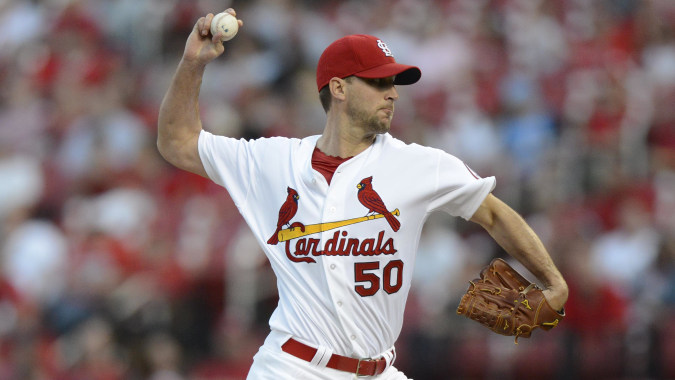
It’s deserving that the franchise with the 2nd most world championships has an iconic uniform – and that’s just what the Cardinals have. The two redbirds perched on the bat along with the lettering and red trim are nothing but intimidating and classic. There’s a reason that St. Louis has never strayed from the path of using this one – it’s become part of the team’s identity. This uniform is to Coca Cola Classic as a new one would be to that crappy alternate formula. If it ain’t broke, don’t fix it.
- # 14 – Atlanta Braves – Home Alternate

Though it may seem like I have a bias towards this team…..ok, fine, I totally have a bias towards this team. But what can I say, I’m a sucker for the cream! The waves of nostalgia created by the cream color just feel so right. When a player wears this uniform with his pant legs rolled up so we can see the socks, gosh, it feels like you’re back in the 1920s. This uniform knows where it came from and is a tip of the cap to uniforms of the past. It’s fitting that the longest continually operating franchise in all of American sports would sport a uniform such as this. As a dedicated Braves’ fan, I can honestly say that this is my favorite uniform of theirs – the red and blue alternates are nice, but they have nothing on the cream.
- #13 – Baltimore Orioles – Home Alternate

Like the Astros, the Oriole brand has also recently returned to its roots with the return of the cartoon Oriole Bird and white caps. This is a uniform that balances their respective color palate well. The red brick and exposed steel of the retro ballpark at Camden Yards makes this uniform feel even more appropriate.
- #12 – Boston Red Sox – Home

A relatively new design concept compared to the Red Sox uniforms of the past. The old uniforms were kind of dingy and didn’t have the same pop that these do. Much like the Cardinals, these uniforms have helped mold the team’s identity and underdog mentality. This picture even captures the mandatory facial hair that has become a standard for the Red Sox roster.
- #11 – New York Yankees – Home

If this ranking was solely based on how well the uniform fit the culture of the team, this one would clearly be the winner. While many teams have tried to copy the signature style from the Bronx (I’m looking at you Philadelphia, Chicago, and Minnesota), nobody can pull this look off better the Yanks. When a player puts on this uniform, they are literally wearing history – it’s almost as if they are wearing a national monument. 28 world championships have been won by players who have worn this uniform, which is why it holds such a stigma of greatness. It is classy, it is refined, it is clean, and is the ultimate sign that you have made it as a professional baseball player.
- #10 – Kansas City Royals – Home

Now while I can’t say that this uniform was worthy of a pop song, I can say that this is one of the most beautiful in baseball. It’s so clean – like something directly out of a White Castle. The Royal Blue and classic lettering look like they should be worn by royalty, and also adds to the charm that Kaufman Stadium has maintained despite the renovations.
- #9 – Chicago Cubs – Home Alternate

I really enjoy how bold the Cubbie Blue is on this uniform, and the bear cub climbing out of the chest insignia is classic and easily recognizable. Though this is a alternate uniform, I like how it still maintains the traditional look and style of the team. While many critics have blasted this franchise for maintaining too much tradition, I think their uniforms are perfectly reasonable. The Cubs are destined to move away from Wrigley Field one day, but I really hope that the team decides to make as little changes to the brand as possible when they do.
- #8 – Los Angeles Angels of Anaheim – Home

Another uniform that makes this list for the same reason as Kansas City: real clean. Besides, angels are supposed to be dressed in white, right? Though it’s a fairly simple design, I just can’t help but comment on how nice it looks. I instinctually know that I like it though I don’t really know why.
- #7 – Pittsburgh Pirates – Home Alternate

Sharpen your swords and hoist the sails, its time to rob something. I’ve always liked the Pirates, and for a city that bleeds black and yellow, this team knows how to pull it off almost just as well as their football counterparts. Though their uniforms in the good old days of “The Family” were just horrendous, these uniforms are intimidating and ultimately fit the team’s personality well. Also, the Pirates, over the course of the past 5 seasons, have won more home games in this uniform than they have in their primary home uniform. Numbers never lie.
- #6 – Oakland Athletics – Home

This one barely escapes the top 5 by a small margin. A lot of people hate green for some reason. Paired with the yellow, I think the colors happen to compliment each other nicely. Like the Red Sox, this uniform screams blue collar. These colors have stood the test of time, remaining unchanged since the 19th century, and continue to fit the team well to this day. Here’s to hoping Billy Beane finally wins the big one soon.
- #5 – San Francisco Giants – Home Alternate

These throwbacks are a tip of the cap to a time period when the Giants franchise was kinda confused about how they were going to identify themselves. This franchise changed it’s color scheme entirely when it moved from the Polo Grounds to Candlestick Park, and though this design may not have stuck around for long, it looks awesome today. This is like the rare species of uniform on this list, and in my opinion, its worn better today than it was 40 years ago. Back then, this configuration was like the awkward puberty stage of the Giants brand development – it was different and insecure and didn’t think it belonged. Now here to stay, I’m proud that it makes it into the top 5.
- #4 – Seattle Mariners – Home Alternate

By far one of the most beautiful uniforms in baseball. I was actually surprised when I found out how long they’ve been wearing this teal blue alternate jersey, because I had never seen it before. This uniform is a welcomed addition to this list simply because there isn’t another uniform like it in baseball. I’m fairly certain that Tampa Bay had something like this before they got rid of the “Devil” in their team name, but I’m really happy the Mariners make up for their loss. I like the water imagery for this team – especially for a franchise located in the London of the U.S. Now if only we could get the Seahawks or the Sounders to wear this color – that way people might actually recognize its brilliance.
- #3 – Texas Rangers – Home Alternate

What an American uniform this is. This configuration makes no apologies, and though this franchise hasn’t won a championship yet, their appearance in this flashy red uniform is intimidating and powerful. The State Flag of Texas patch is a nice touch as well. The Rangers seem like the visiting team’s judge, jury, and executioner when they button up in this configuration. This is also the favorite uniform choice of Ace SP Yu Darvish, so they’re used fairly frequently. Everything is bigger in Texas, and I guess that goes for style on the diamond as well. Definitely a keeper.
- #2 – Toronto Blue Jays – Home Alternate

I’d just like to start off by saying that there isn’t much of a difference between the regular home configuration and the alternate (the color of the text and jersey are interchanged – that’s really it), but I just picked the one I liked the best. I really like how the franchise decided to return to the retro Blue Jays font and insignia after those few years where they had that really weird looking Blue Jay who looked like it wanted to eat you. This uniform is absolutely stunning. The blue jersey, the Blue Jay logo, and that signature font that the franchise now uses for almost everything radiate nostalgia and breathe new life into a ball club that is slowly resurging to prominence.
- #1 – Kansas City Royals – Home Alternate

Yes, the Royals get two spots on this list. Why? Because I can’t help it that the franchise improved on something that was already too sexy for its own good by introducing a jersey in powder blue. My god. These things are lovely. This is absolutely the fine wine of all baseball uniforms. We’ve graduated for girl to woman, boy to man. I wish I had pajamas that looked like these. The different shades of blue get all up in your face and overwhelm you with a memory a song your parents sung to you as a kid. You didn’t remember the song until just now, realizing that it’s always been there, keeping you company. If I was to wear this during a game, I wouldn’t want to get it dirty – it’s just too perfect in almost every way. This is exactly the kind of uniforms I’m sure the baseball gods wear. I hope one of these is hanging in my closet when I get to heaven – I might just never take it off. Bravo Kansas City. Thank you for restoring my faith in the wonders of this world with the loveliness that is your powder blue alternate uniforms.
